Impossible Layout with ResizeObserver
Apr 16, 2023
A few months ago at work I was developing a new feature to improve our users’ experience managing their purchases and sales, and I faced some technical challenges imposed by the web platform. In this post I’ll share my journey on how I managed to solve this impossible layout using the ResizeObserver API.
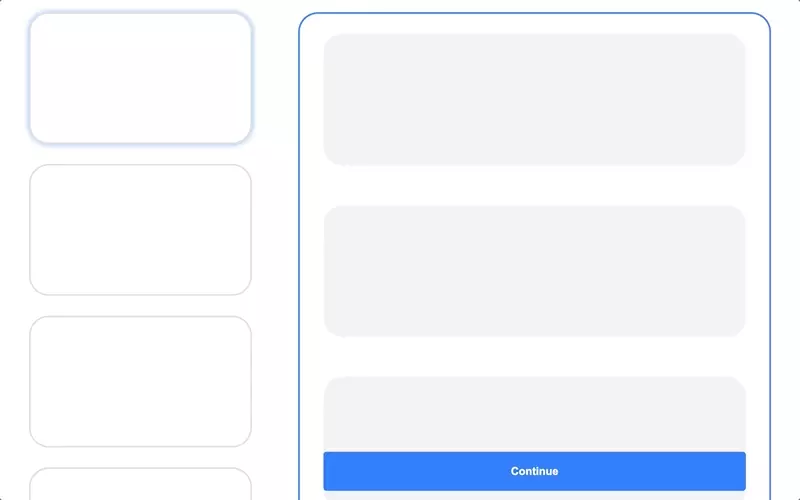
The Layout
It consists of two columns: the left one has a list of cards and the right one displays the selected item details with dynamic content, as shown below:
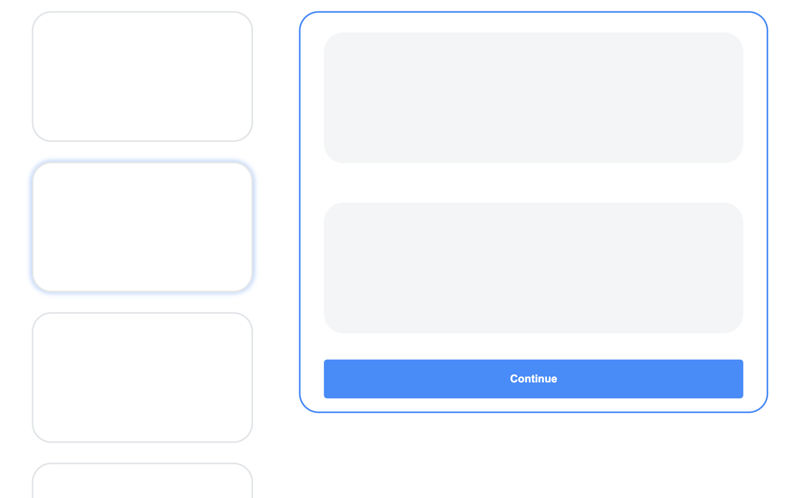
I quickly notice an issue: if the list is too long and the user scrolls down and selects an item, it appears like nothing has happened on the screen because the card was rendered way up in the document.
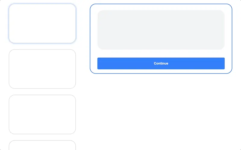
Make it sticky
I fixed this by making the right side sticky, but another issue popped up. If the content was larger than the browser viewport, the user would have to scroll all the way down to see the rest. This was a big problem because there are some action buttons at the bottom that the user woudln’t be able to see.
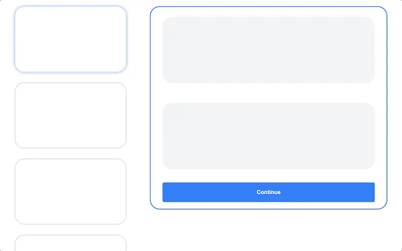
Maybe two scrollbars
So, I thought, why not have two scrolling areas? But it wasn’t very intuitive and, to be honest, the scrollbars made me puke. 🤮
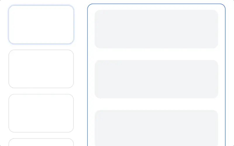
Or fixed buttons
My next attempt was fixing the action buttons to the bottom, so they were always in sight, but it didn’t look good, and users still had to scroll down to see the rest of the content.
At this point, I’m not gonna lie, I was pretty upset. I tried different ideas, but none of them worked. So I decided to do some research, and I found this tweet that enlightened me. It was exactly the answer to my problem.
If a position:sticky side-column is taller than the viewport, should its bottom part scroll into view…
A) early, as soon as the user starts scrolling the page
B) late, only once the user scrolls to the bottom of the page
(browsers do B, convo about A: https://t.co/SrAw9YOVpq )
— Šime (@simevidas) February 23, 2022
Now, I knew that when my side column was larger than the viewport, its bottom part should scroll early, as soon as the user starts scrolling the page.
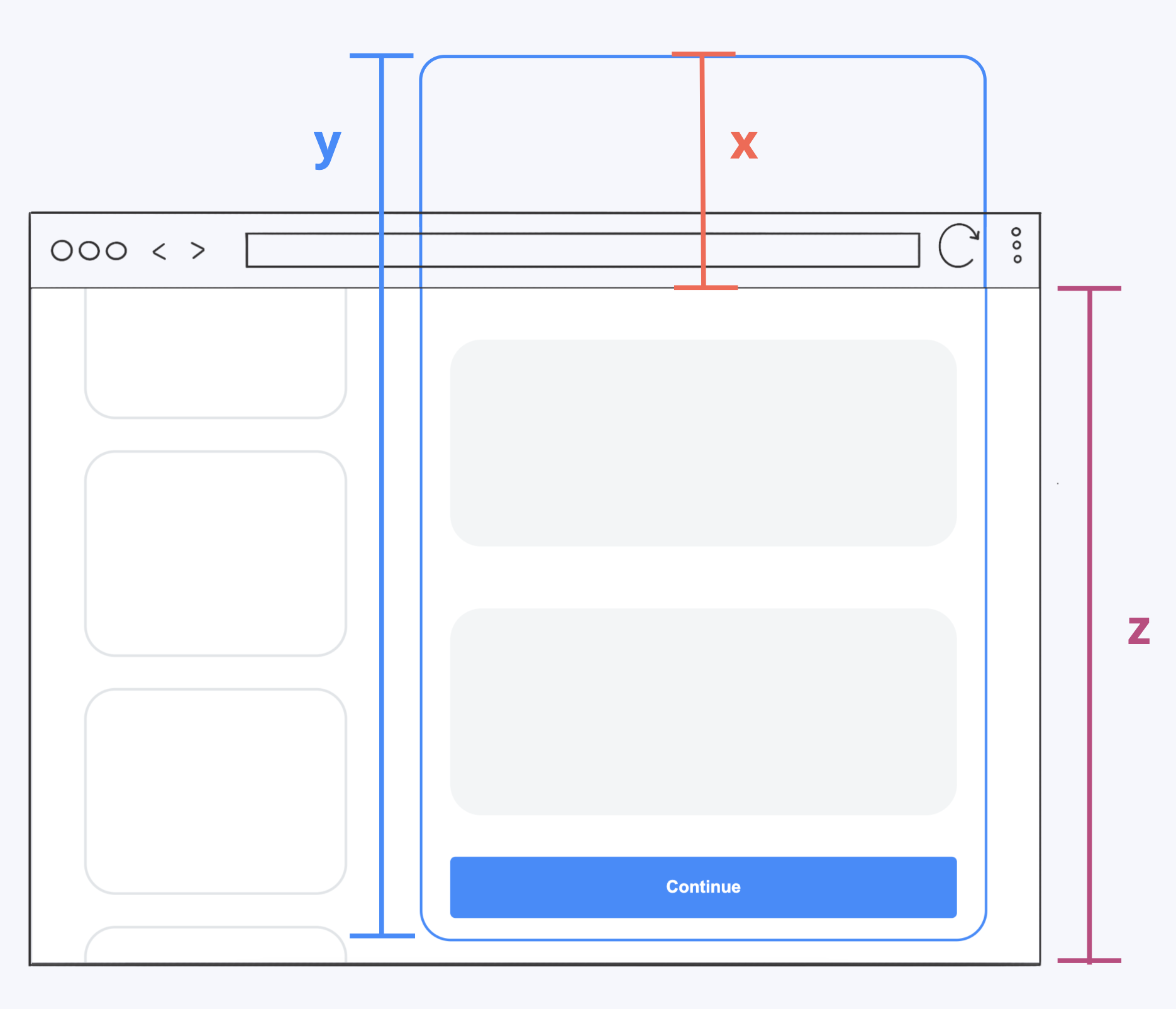
Offset
To accomplish this, I also knew I needed to calculate the offset, in this case x, to add it as a negative top to my container. So the formula would be the container height (y) minus the viewport height (z).
x = y - z
I had the solution but one last issue still remained: I didn’t know the dynamic container height.
ResizeObserver to the rescue!
To figure it out, I used this API that allows you to get notified when the size of a given element changes, and it works by passing a callback to the constructor that receives a representation of the element’s new size:
new ResizeObserver((entries) => {
  // Check the entry is not an empty array.
  const entry = entries.find(Boolean);
  if (entry?.contentRect) {
    // Calculate the top offset subtracting the viewport height
    // minus the observed element height
    const topOffset = Math.min(
      document.documentElement.clientHeight -
        entry.contentRect.height -
        SPACING, // Minus some spacing to make it look nicer
      SPACING
    );
    // Add the top offset to the container element
    entry.target.style.top = `${topOffset}px`;
  }
}).observe(summary); // Start observing the container element
The result
With this simple and clean approach, we ensure the user can see the entire content as soon as they start scrolling, and the container stays visible at all times, resulting in a sleek and intuitive UI.
Thanks a lot for reading! Remember to keep exploring the endless possibilities of the web and leveraging these powerful tools to create more engaging user experiences. Also, here’s a direct link to the code examples featured in the post, in case you want to check them out.